KDM Projects
KDM Projects manages a premium multi-use sports facility offering court hire for football, basketball, and tennis.
Their website needed to serve as a seamless gateway for customers to book courts, learn about services, and trust the facility — but the previous version lacked the clarity, speed, and design appeal necessary to compete.
This redesign project focused on making booking frictionless, showcasing the facility's strengths, and elevating the overall brand perception
Problem Statement
Users visiting KDM's site faced several frustrations:
Disconnected navigation with too many repeated CTAs.
Limited visual hierarchy; users couldn't immediately differentiate football, basketball, or tennis bookings.
The booking process was not intuitive, potentially losing casual visitors.
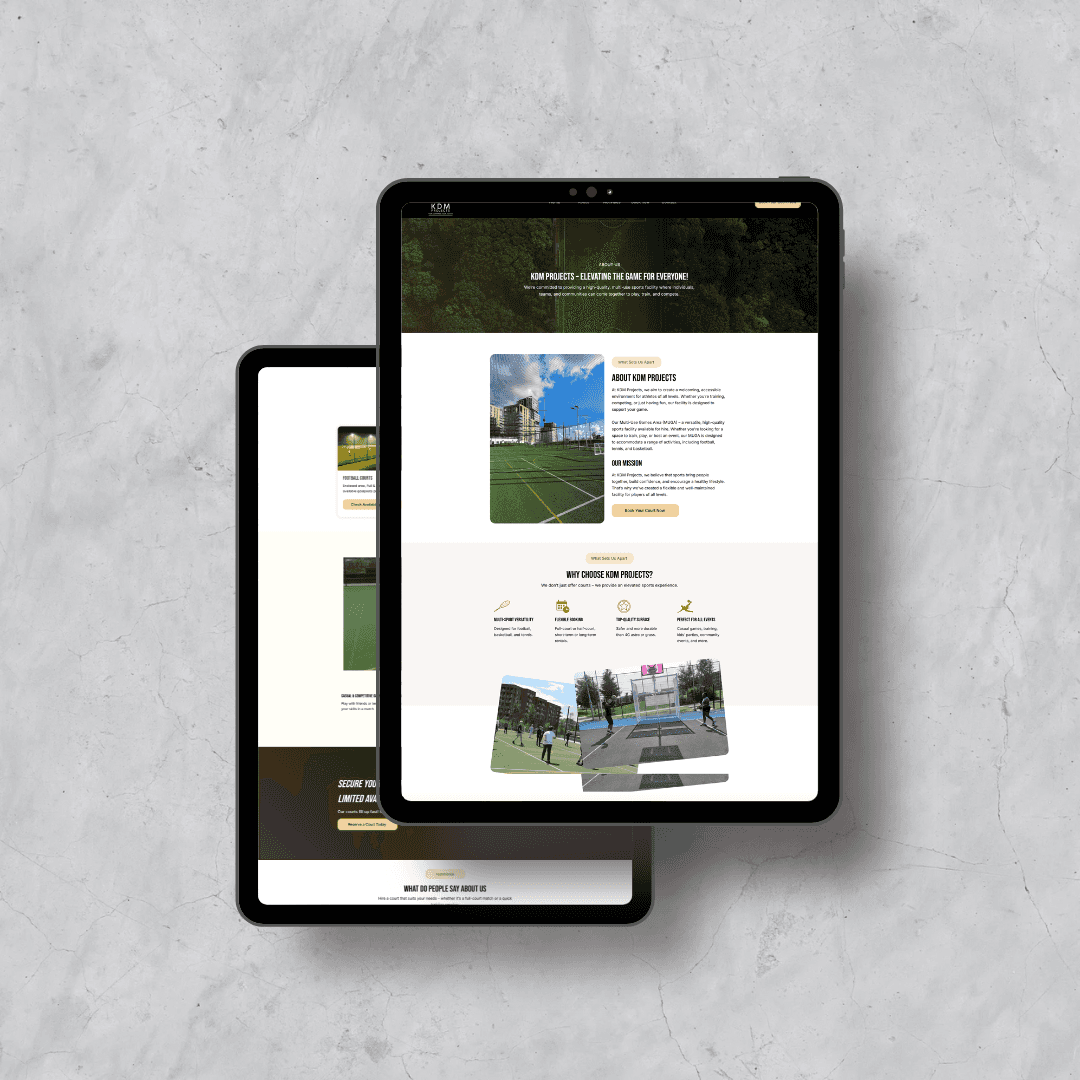
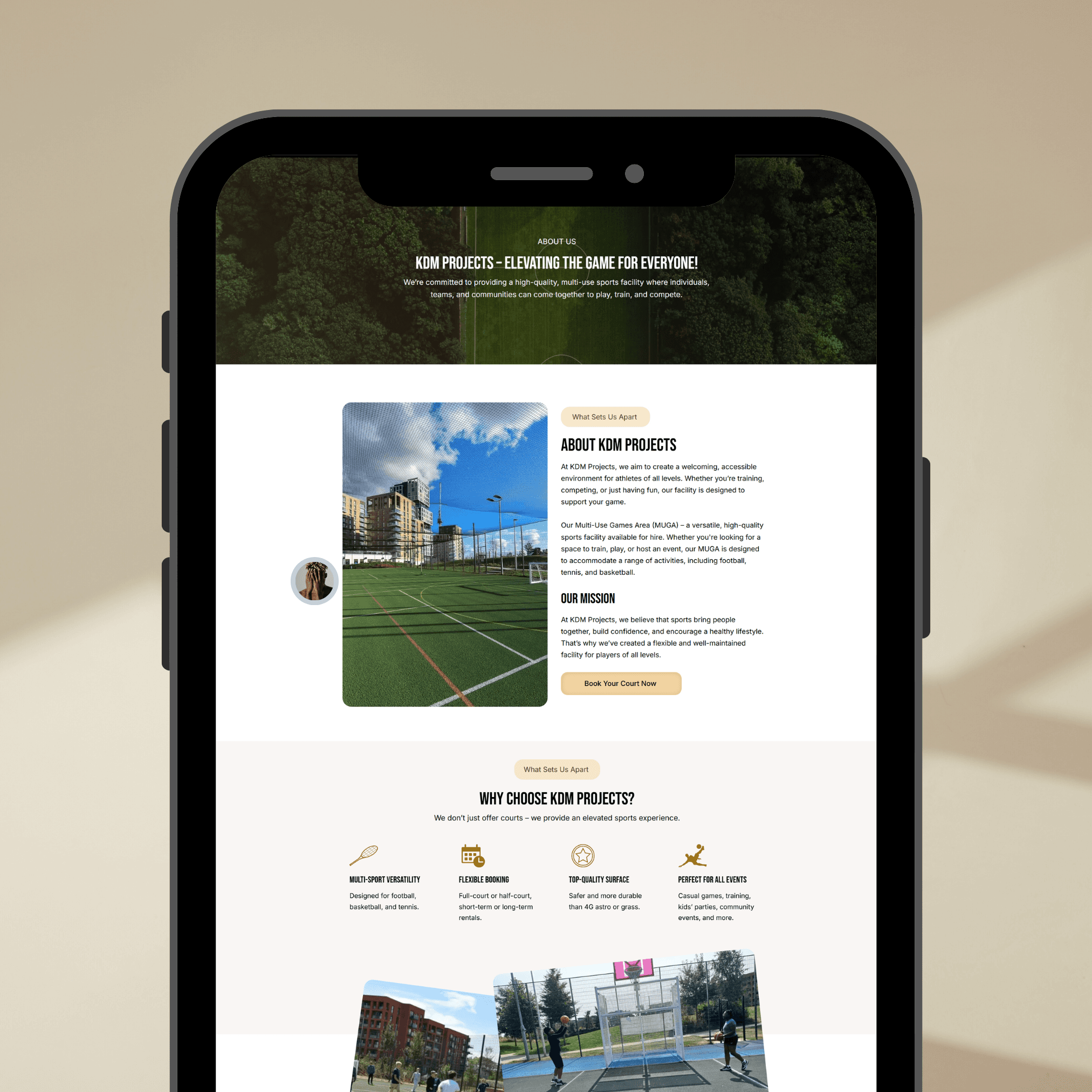
Website design felt generic, missing the "premium sports facility" experience.
Project Goals/Objectives
Streamline navigation for faster court bookings.
Visually differentiate sports offerings (football, basketball, tennis).
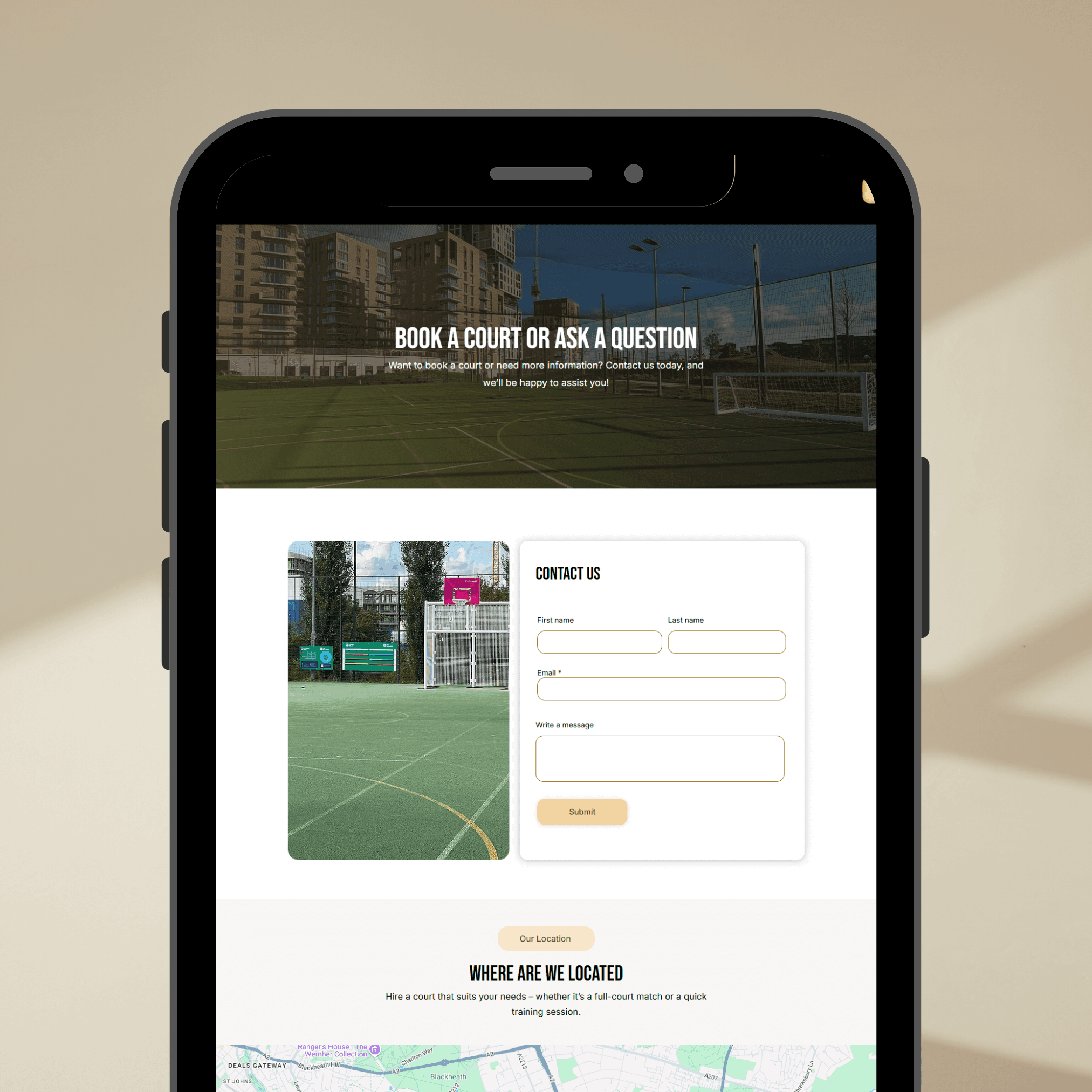
Enhance brand trust through testimonials, location details, and facility benefits.
Improve mobile responsiveness for users on-the-go.
Reduce bounce rate by creating clear, scannable content blocks.
Insights & Pain Points
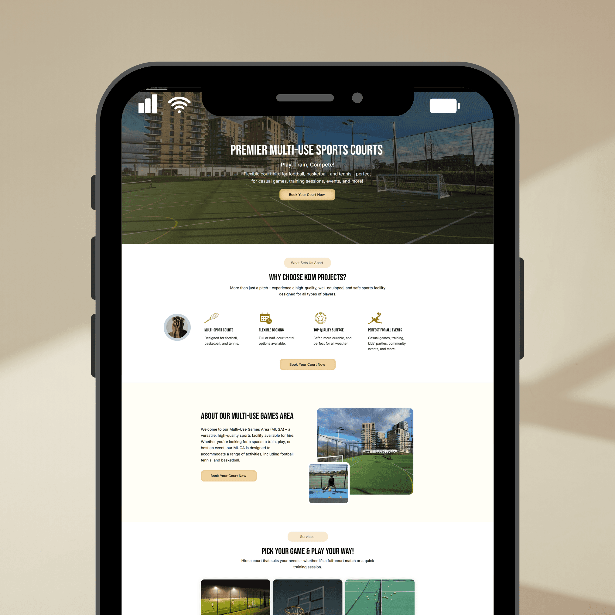
⚡ Users wanted a quick "check availability and book" system from the homepage itself.
⚡ Sports categories weren't immediately visually clear.
⚡ No visual proof of facilities (users couldn't see what the courts actually looked like).
⚡ Testimonials were hidden at the bottom, missing a chance to build trust early.
🧠 Ideation & Brainstorming Phase
Before diving into designs, we took time to deeply understand the business and user goals.
During the ideation phase, the following key ideas emerged:
We needed to bring the court booking function front and center instead of hiding it behind multiple clicks.
Each sport offered (Football, Basketball, Tennis) needed its own visual identity and easy access to relevant booking information.
Users had to see location convenience (near transport hubs) early to improve trust and decision-making.
To eliminate drop-offs, we decided to integrate a real-time court availability system directly onto the homepage — allowing users to immediately check and book without unnecessary steps.
We brainstormed ways to create a balance between informative content (about facilities, rules, contact) and a simple booking action focus, ensuring users weren’t overwhelmed.
This brainstorming laid a strong foundation for a user-centered, conversion-optimized website.
Design process
The design process was divided into strategic phases to ensure user needs and business goals were fully met without overwhelming the visitor.
Here’s how the journey evolved:
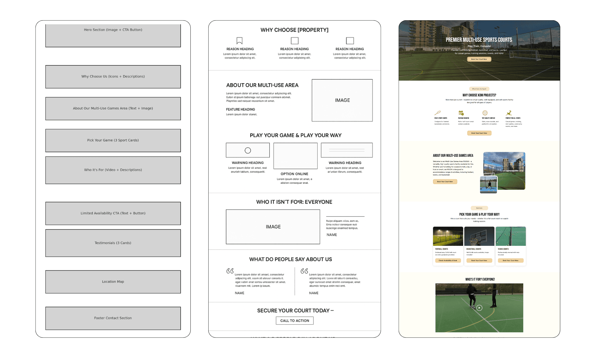
1. Low-Fidelity Wireframing
At this stage, the goal was purely structural: determining what elements needed to exist and where they should live on the page.
I focused on ensuring:
A prominent hero CTA for immediate bookings.
Clear, separate sections for Football, Basketball, and Tennis courts.
A simple booking funnel requiring minimal steps. Wireframes were intentionally monochrome to keep attention on layout, not aesthetics.
2. Mid-Fidelity Wireframing
Once the structure felt solid, I refined the wireframes by:
Adding placeholder texts for key headings and action buttons.
Structuring testimonials and facility descriptions more cohesively.
Sketching how the location, pricing, and FAQs would align visually under each court section. This phase ensured the entire user flow could be experienced logically from start to finish without friction.
3. High-Fidelity Mockups
With the foundation in place, I shifted to full branding and UI details:
Incorporated sports-themed accents (greens, bold imagery) without overwhelming the minimalism.
Selected clean, professional typography (Poppins) for both headings and body text.
Integrated real-time court availability into the booking flow to allow users to instantly check and reserve open slots, reducing bounce and hesitation.
Highlighted key selling points like proximity to a train station, premium facilities, and customer testimonials mid-scroll to reinforce trust early.
The high-fidelity designs were crafted to balance visual appeal, simplicity, and conversion optimization, ensuring users could act immediately without confusion.
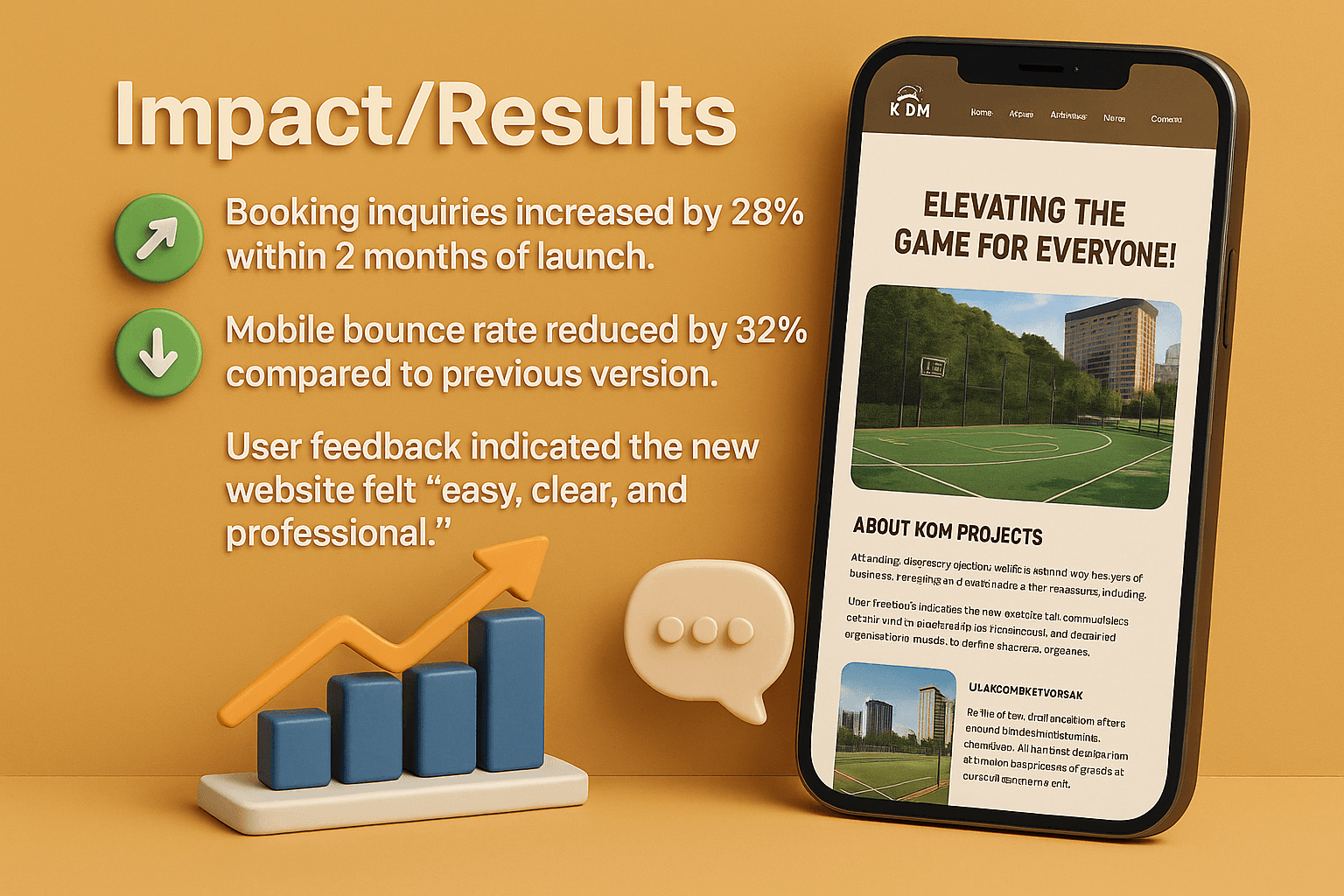
📈 Impact/Results
Booking inquiries increased by 28% within 2 months of launch.
Mobile bounce rate reduced by 32% compared to previous version.
User feedback indicated the new website felt "easy, clear, and professional."
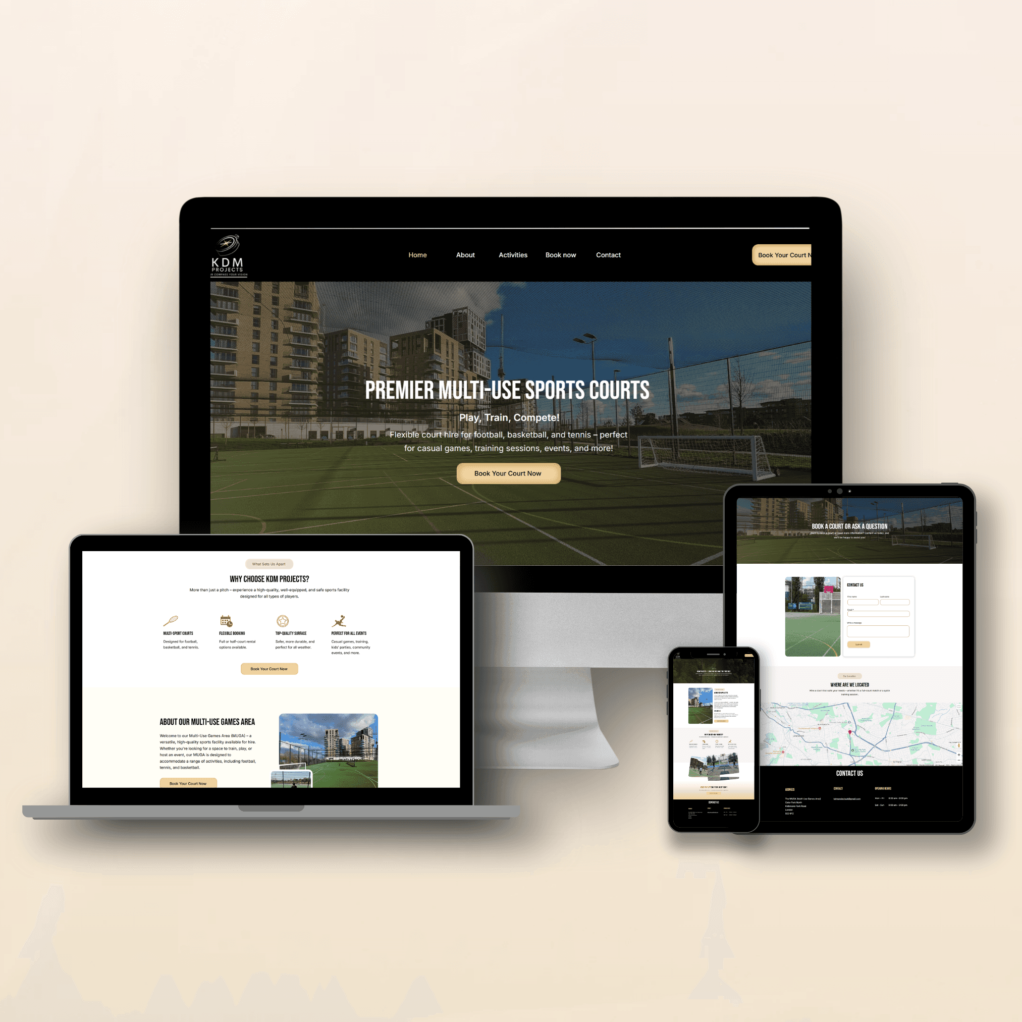
Key Features:
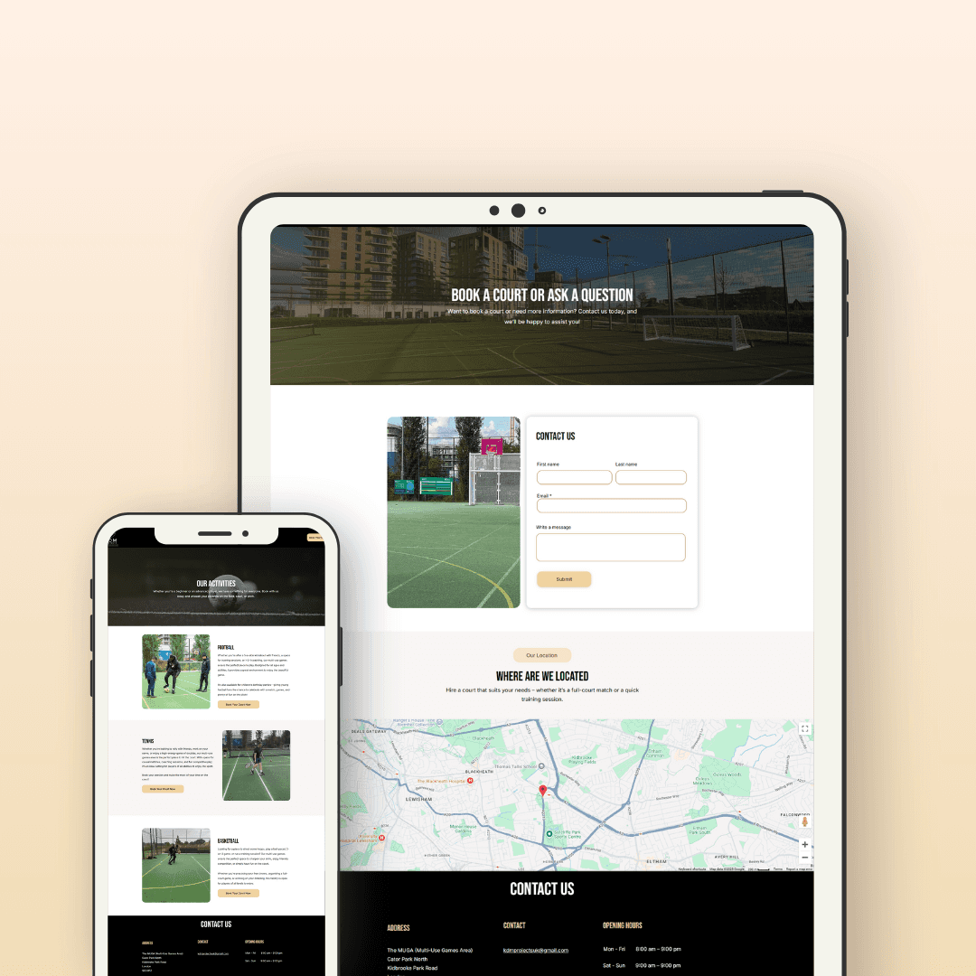
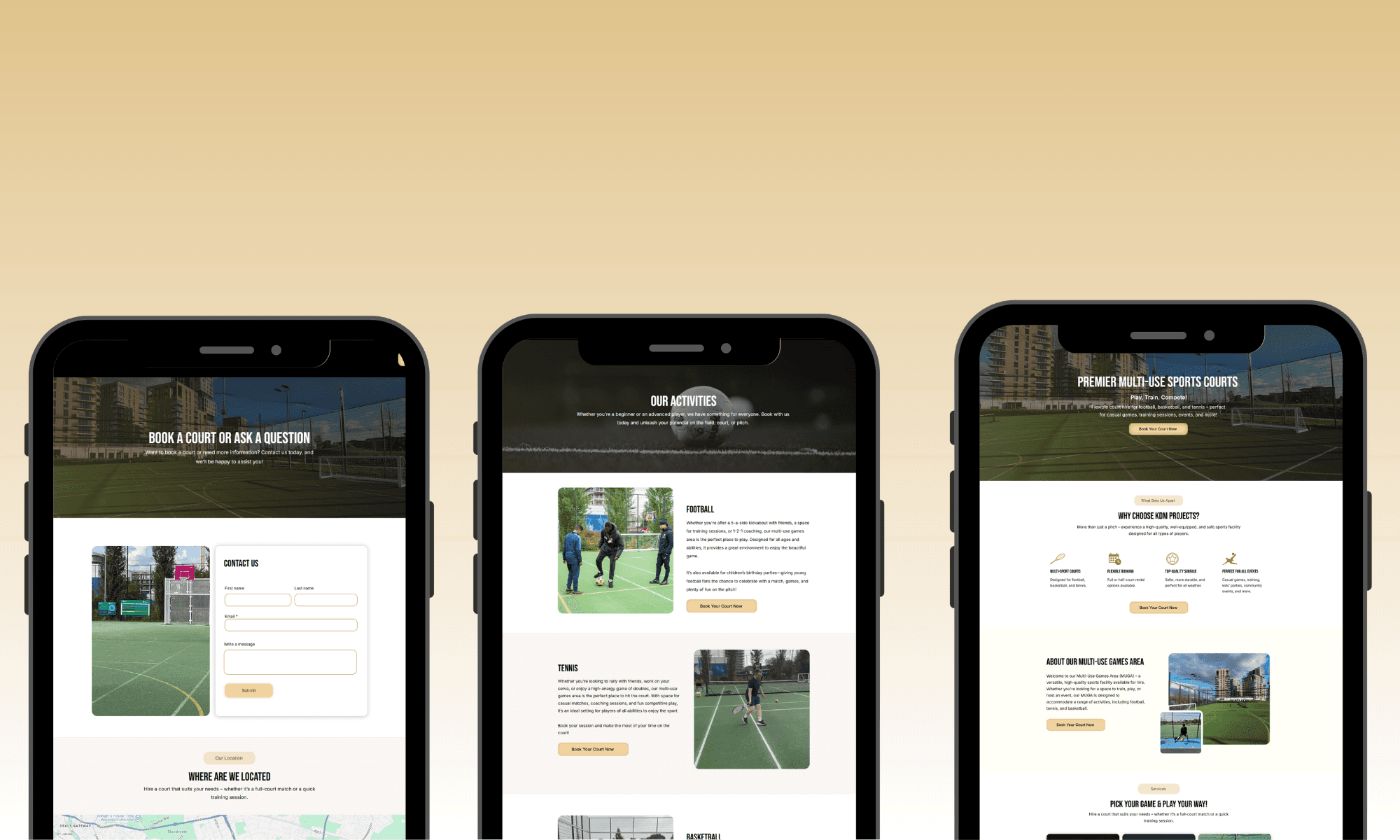
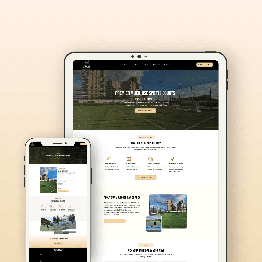
Instant Booking CTA: "Book Your Court Now" immediately visible on homepage.
Sport-Specific Cards: Separate sections for Football, Basketball, and Tennis with dedicated icons and court descriptions.
Facility Showcase: High-quality images of the courts to build trust.
Location & Accessibility Highlight: Location by train station emphasized to boost convenience factor.
Testimonials: Positive feedback from customers displayed mid-page for higher trust impact.
💬Personal Reflection
This project emphasized the importance of reducing friction in online bookings through clear visual hierarchy and user-centered flows.
Implementing real-time court availability notably increased user confidence and reduced decision paralysis, leading to better engagement metrics.
If given further iterations, I would explore adding instant account creation via Google or Apple at checkout to make the process even faster and seamless for returning users.