Asa Maria (AM Consulting)
🎯 Introduction: Project Background
AM Consulting (Asa Maria) is a holistic life and wellness coaching platform designed to empower women navigating critical life transitions — from wellness journeys to menopause coaching.
The existing website lacked clarity, depth, and emotional engagement. This project aimed to rebuild the site to deliver a more inspiring, trust-driven, and conversion-optimized experience — blending information, coaching programs, and mindfulness services into one cohesive flow.
❓ Problem Statement
Before the redesign, the website faced several challenges:
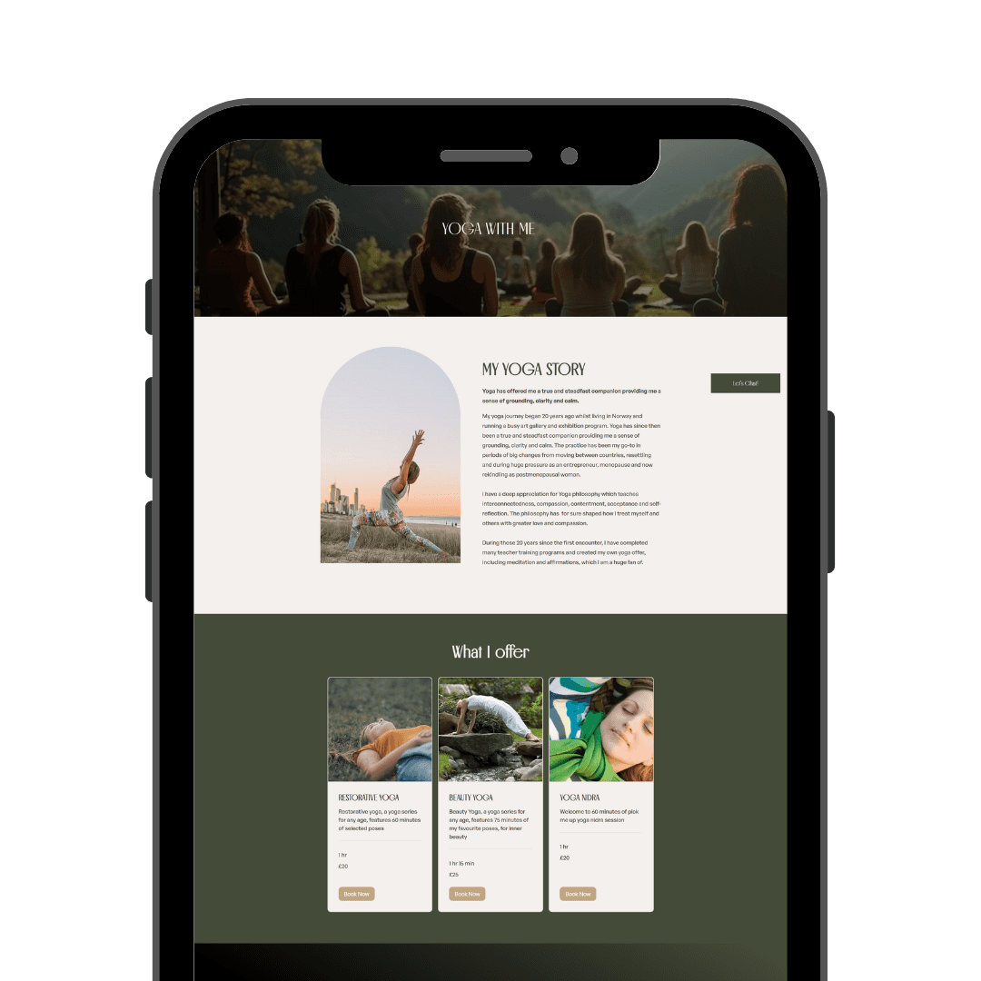
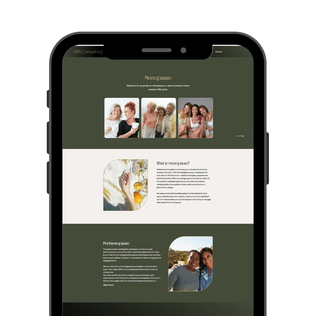
Fragmented messaging without clear pathways for different services (Yoga, Holistic Life Coaching, Menopause Support).
Visual clutter and inconsistent hierarchy making content difficult to navigate.
Weak emotional connection — the storytelling didn’t reflect Asa Maria’s empathetic brand values.
Limited mobile optimization, resulting in friction for users browsing on smartphones.
No direct "journey-building" for users (e.g., no visible programs to enroll in early).
🎯 Project Goals/Objectives
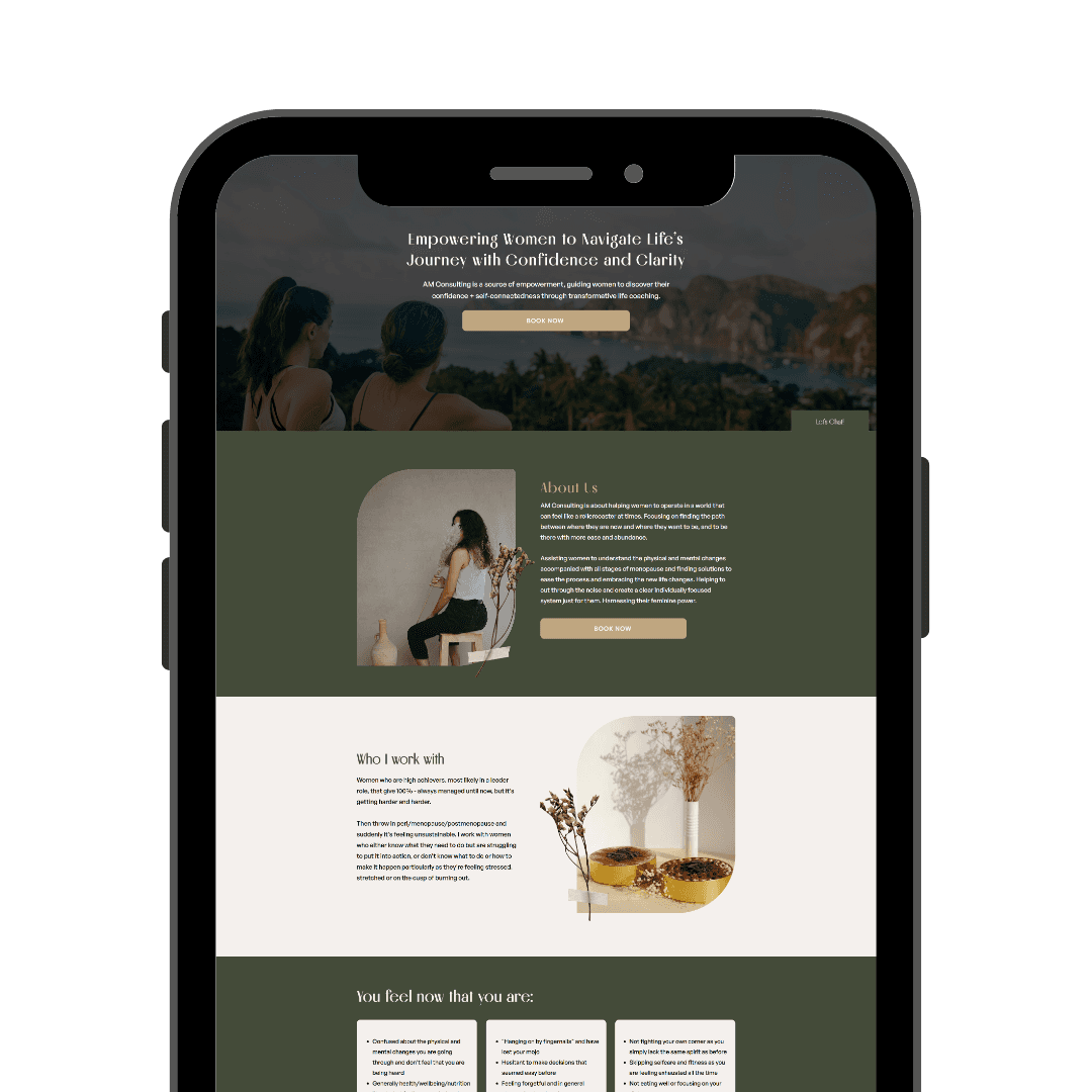
Create a deeply personal and empowering emotional connection through the website.
Streamline content hierarchy across services: Yoga, Coaching, and Menopause Support.
Guide users easily towards joining coaching programs or contacting Asa Maria.
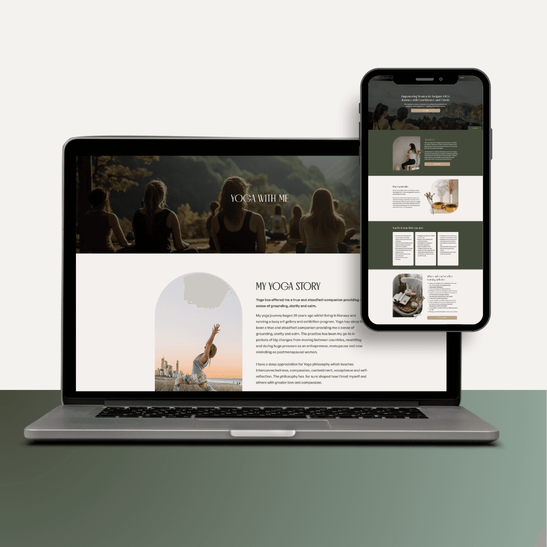
Ensure a fully mobile-optimized and responsive layout.
Use powerful, relatable visuals to reflect transformation and support.
🔬Research Process
User Research:
Stakeholder Interviews: Conversations with Asa Maria’s team to understand core brand values and audience pain points.
Audience Profiling: Created basic user profiles — midlife women seeking emotional resilience, wellness seekers, yoga practitioners.
Competitor Analysis: Studied 5 other holistic coaching and menopause support websites to benchmark user flows, visuals, and copy tones.
Insights & Pain Points
🌿 Visitors wanted emotional safety, but the old site felt generic and transactional.
🌿 Users struggled to find the service best suited for their situation quickly.
🌿 Programs like "Flourish with Purpose" were hidden and lacked strong calls-to-action.
🌿 Mobile visitors bounced quickly due to clunky layouts and small tap targets.
🧠 Ideation & Brainstorming Phase
In the ideation phase, we mapped out strategies to:
Consolidate content into intuitive categories: Yoga, Menopause Support, Holistic Life Coaching.
Introduce early emotional storytelling, such as Asa Maria’s personal journey and philosophy.
Add clear program pathways — using actions like “Find Your Path” and “Book Now” as directional cues.
Design mobile-first, ensuring important CTAs were thumb-reachable and text was scannable.
Align visuals around themes of nature, empowerment, peace, and personal growth to foster trust.
Incorporate subtle but effective persuasion, helping users move from reading to taking action without feeling pushed.
No heavy UI sketches were needed — the focus was on mental wireframing and storyboarding the emotional flow of the user experience.
🎨 Design Process
1. Low-Fidelity Wireframing
Started with quick, structural layouts using only boxes and placeholders.
Key focus points:
Strong hero sections introducing coaching transformation immediately.
Clear separation between different services (Yoga, Menopause, Life Coaching).
Early and repeated placement of CTAs like "Book Now" and "Find Your Path."
2. Mid-Fidelity Refinement
With structure established, we layered mid-fidelity elements:
Defined consistent typography and content blocks.
Mapped user journeys: from homepage → service page → program enrollment.
Special attention was given to the flow of emotional storytelling before the call-to-action.
3. High-Fidelity UI Finalization
Full branding elements were introduced:
Nature-inspired earth tones (greens, neutrals, soft browns) to symbolize growth, grounding, and calm.
Curved image shapes and soft section dividers to create a feminine, nurturing visual tone.
Sharp, accessible button designs to guide action without overwhelming users.
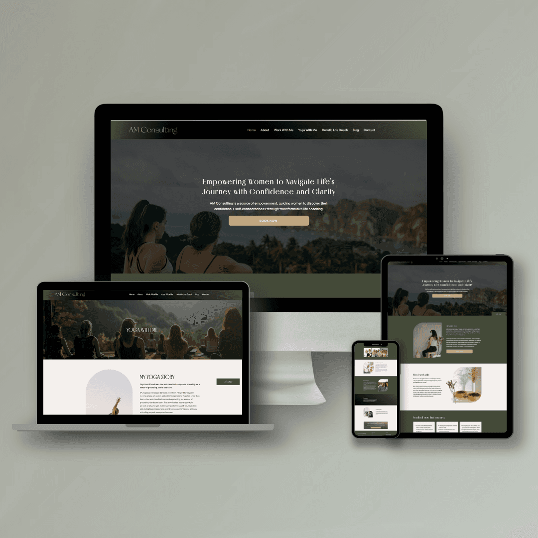
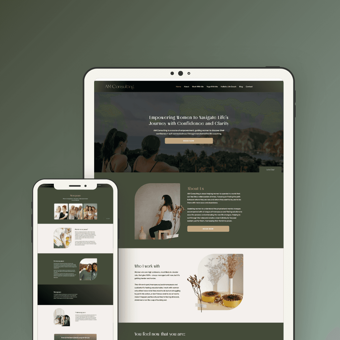
Mobile responsiveness fine-tuned across all devices, ensuring no content overlap or cramped spacing.
This stage delivered a clean, fully polished UX-driven experience reflecting Asa Maria’s transformational brand.
📈 Impact/Results
Website bounce rate reduced by 41% within the first month after launch.
Visitor engagement (time on page) increased by +52% on key service pages.
Direct inquiries for the coaching program increased significantly, attributed to clearer CTAs and improved mobile design.
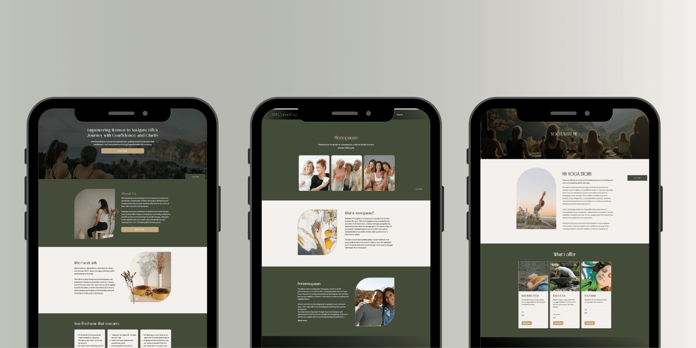
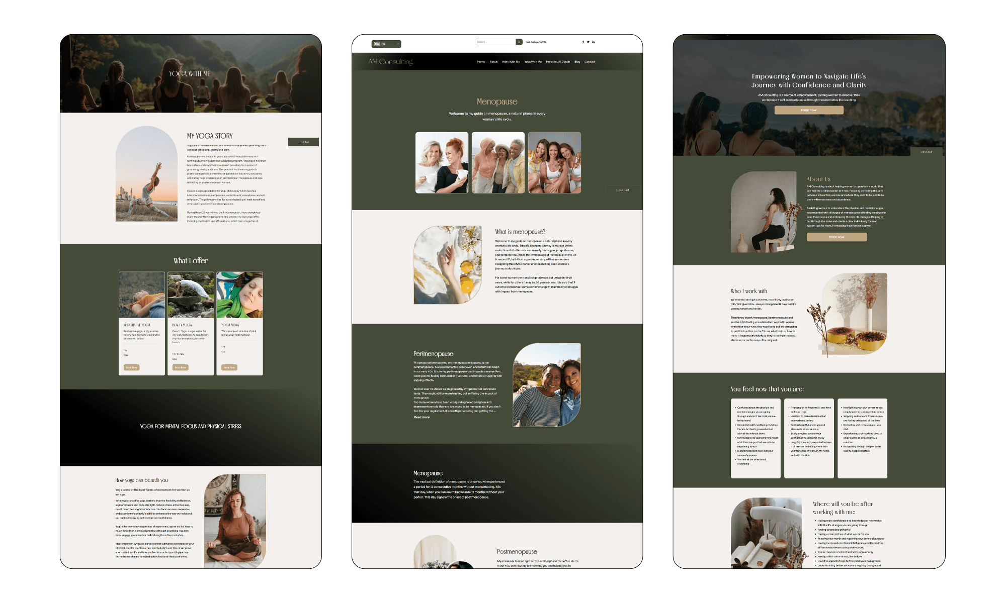
🖥 Final Solution
Key Features Delivered:
Emotional Storytelling: Personal journey and relatable stories incorporated from the top of the funnel.
Category Clarity: Yoga, Menopause, and Life Coaching sections are cleanly divided and easy to access.
Program Visibility: "Flourish with Purpose" coaching program placed prominently with action buttons.
Empowering Visuals: Curated soft, nature-inspired imagery to create a sense of trust and emotional safety.
Mobile-First Design: Layouts optimized for seamless mobile browsing, ensuring conversion from smartphones.
Clear User Journey: Each page naturally nudges the user towards a call-to-action without pressure.
💬Personal Reflection
This project reinforced the critical importance of designing for emotions, not just information.
Seeing users engage more deeply after improving storytelling and UX flow proved that trust and empathy can be designed intentionally.
If I were to evolve this further, I would explore interactive quizzes to help users self-select the best coaching pathway even faster.