Don't Die Dan (DDD)
🎯 Introduction: Project Background
Don’t Die Dan (DDD) is not just a meme coin — it’s a multimedia adventure experience merged with blockchain. The project blends daring expeditions, survival content, and decentralized finance into one bold narrative.
This project involved the design and development of a fully branded website experience to support the DDD token launch, educate investors, and bring storytelling into the crypto space through immersive, high-stakes missions.
❓ Problem Statement
Meme coins often fail due to a lack of structure, credibility, and user guidance. For DDD to succeed in a crowded market, the website needed to:
Educate new users about the project and how to buy.
Build community excitement around the missions.
Clearly present the tokenomics and roadmap.
Create a sense of visual adventure, mystery, and daring.
Maintain a clean, readable layout for mobile and desktop users.
🎯 Project Goals/Objectives
Design a visually striking website that reflects the project’s rugged, extreme tone.
Develop a seamless “How to Buy” flow for non-technical investors.
Present the whitepaper in an engaging, non-intimidating layout.
Optimize layout for storytelling: each expedition mission must feel cinematic.
Ensure fast performance and mobile responsiveness.
Showcase tokenomics transparently to build investor trust.
🔬 Research Process
Discovery & Content Analysis
Worked directly with the DDD founding team to understand project mission and tone.
Reviewed over 15 whitepapers and landing pages from top-performing meme tokens and Web3 content platforms.
User research indicated most meme token buyers are highly visual, impulsive decision-makers.
→ Key insight: clear visuals and punchy CTAs would outperform text-heavy pages.
🔎 Insights & Pain Points
🔥 Users needed a "Buy Now" process that didn’t overwhelm — most were not crypto-savvy.
🔥 Many weren’t sure if the project was real or parody — credibility cues were essential.
🔥 Mobile layout was non-negotiable, as majority of Web3 traffic comes from mobile devices.
🔥 Missions and token utility needed to be framed as entertainment, not just DeFi.
🧠 Ideation & Brainstorming Phase
During ideation, we asked:
“How can a crypto project site feel like an adventure documentary teaser?”
From this question, several core ideas were born:
Split the site into four narrative-driven pages: Home, Missions, Whitepaper, How to Buy.
Each mission should feel like an episode or cinematic teaser.
Use large typography and bold color gradients to simulate urgency and energy.
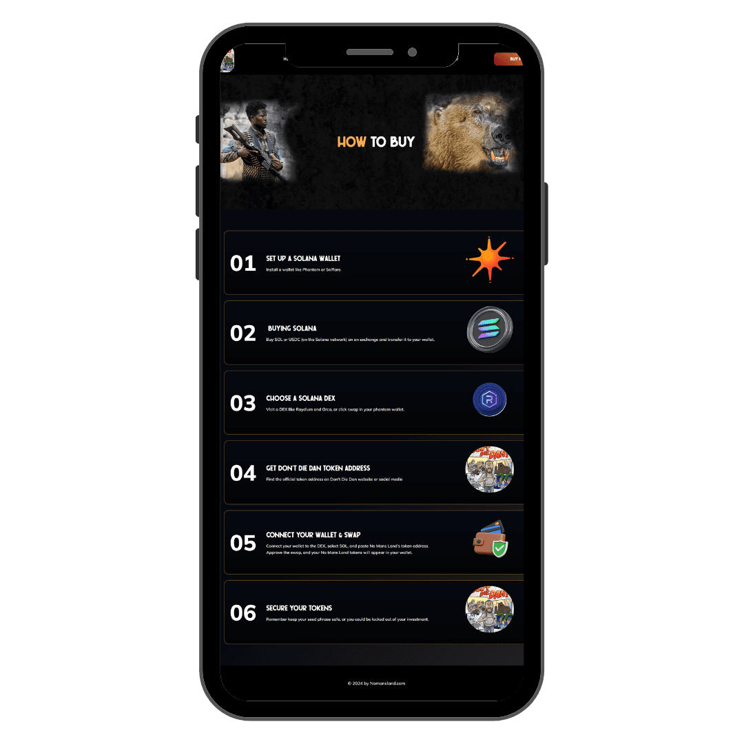
Create a step-by-step token purchase guide using numbered cards and icons to lower entry barriers.
Include infographics and custom charts for tokenomics instead of relying solely on text.
This phase shaped the story-first structure and visual intensity of the design.
🎨 Design Process
1. Low-Fidelity Wireframing
We started by sketching basic flow outlines:
Hero → Coin Address → Top 5 Missions → Tokenomics → CTA
Second wireframe for “How to Buy” — broken into six steps with visual cues and icons
Emphasis on scroll-triggered interactions for engagement
2. Mid-Fidelity Layout Drafts
Here we implemented:
Page divisions with alternating dark/light sections to improve contrast and scroll pacing.
Real layout of pie charts, CTA buttons, and token roadmap using mock content blocks.
Defined a modular structure for future updates like new missions or investor news.
3. High-Fidelity UI Design
At this stage, full brand assets were applied:
Fiery orange-red gradients and black stone textures to simulate “adrenaline + danger”
Bold type (Righteous, Poppins) to create a strong visual voice
Custom visuals of Dan, the polar bear, and mission assets to drive cinematic tone
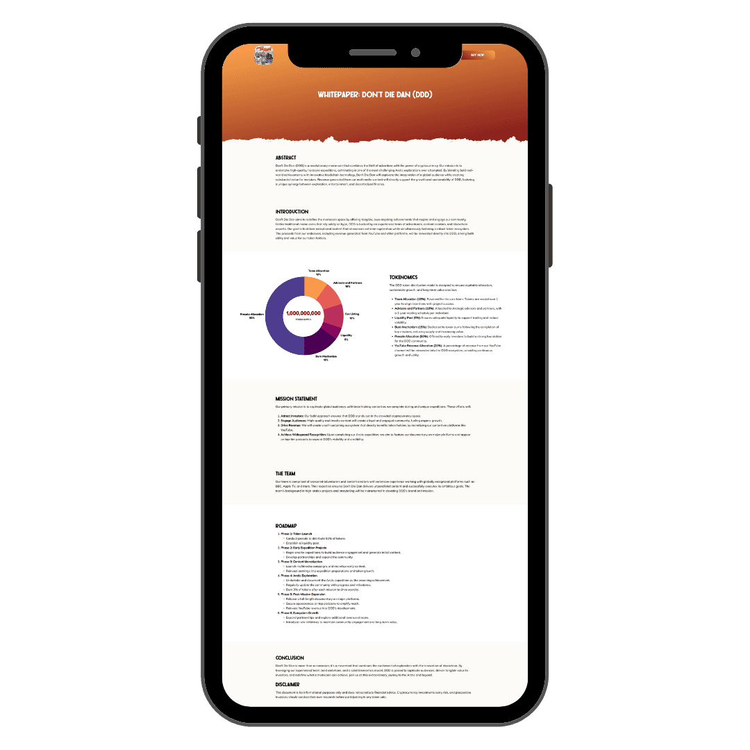
Tokenomics chart designed from scratch with clear labeling and segmented highlights
Mobile-first design applied rigorously — every section was manually optimized for smartphone viewing
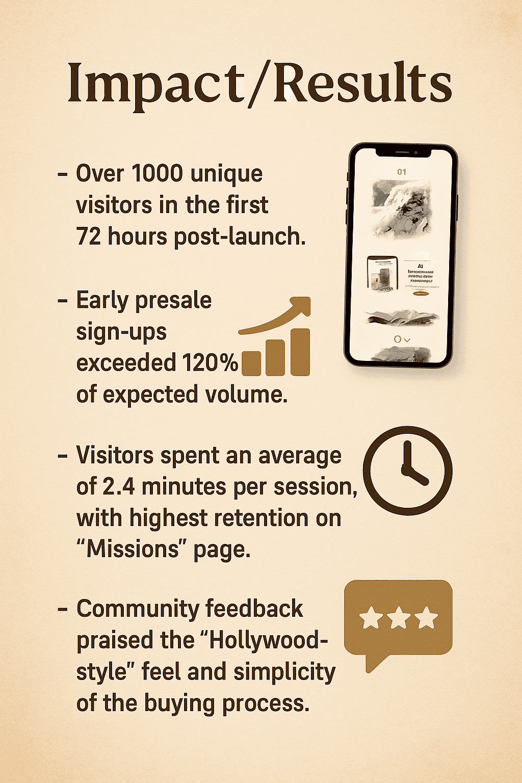
📈 Impact/Results
Over 1000 unique visitors in the first 72 hours post-launch.
Early presale sign-ups exceeded 120% of expected volume.
Visitors spent an average of 2.4 minutes per session, with highest retention on the “Missions” page.
Community feedback praised the “Hollywood-style” feel and simplicity of the buying process.
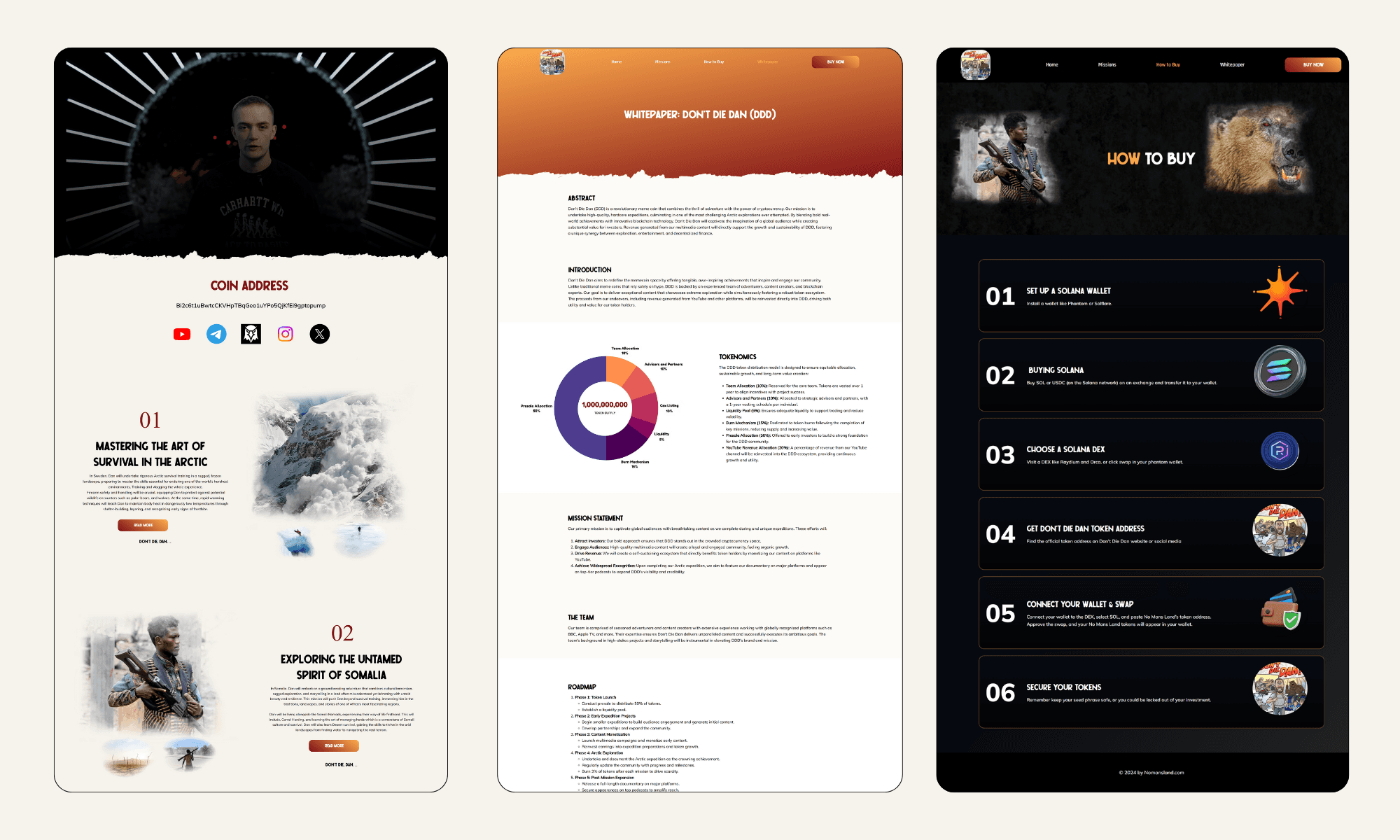
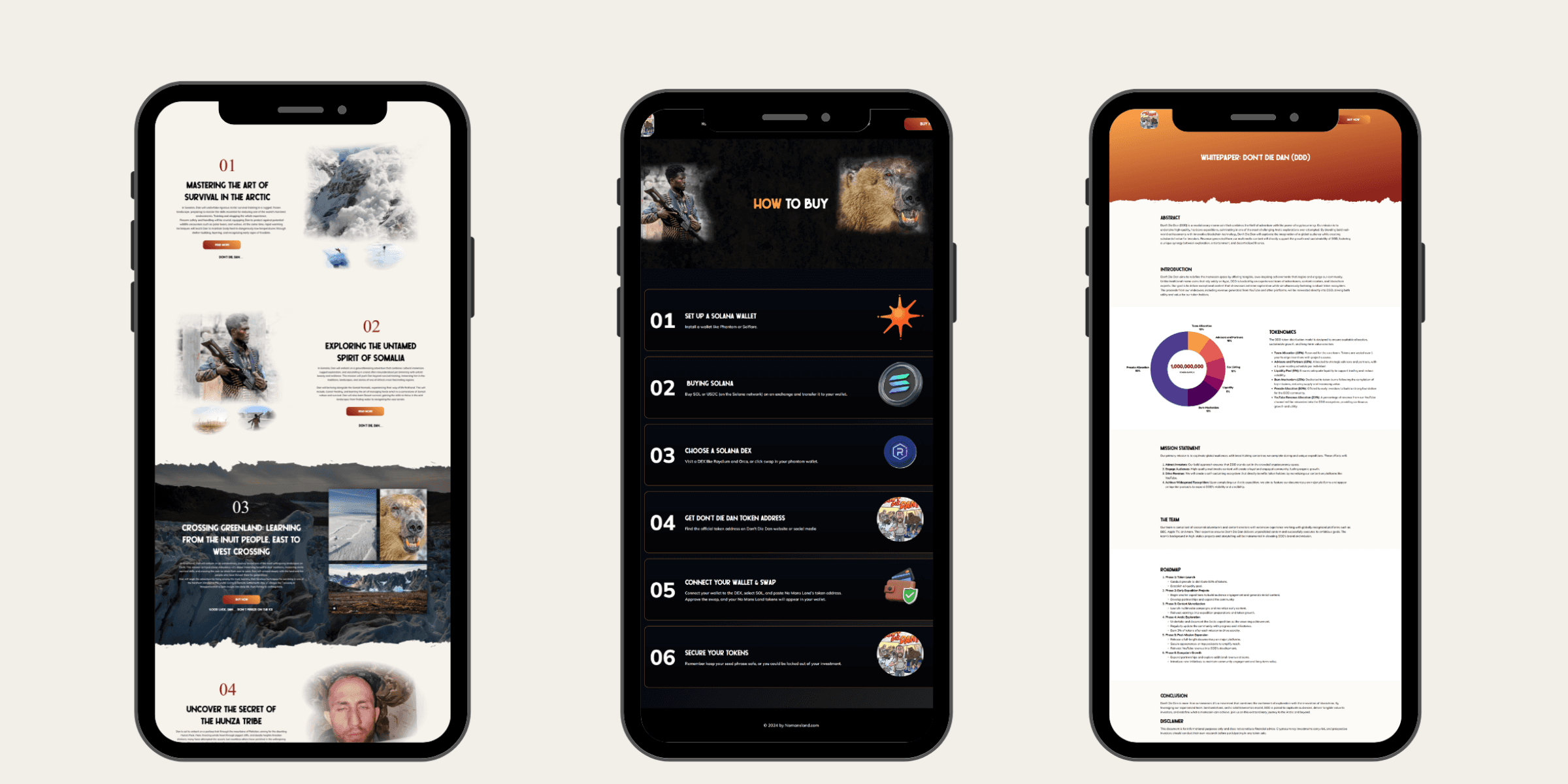
🖥 Final Solution
Key Features Delivered:
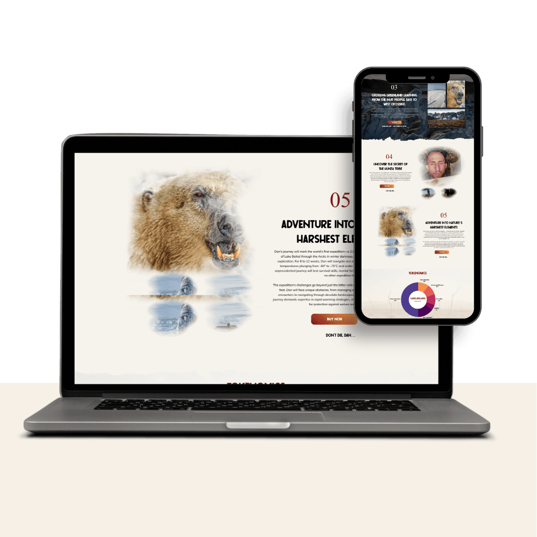
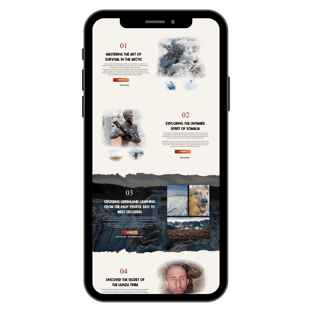
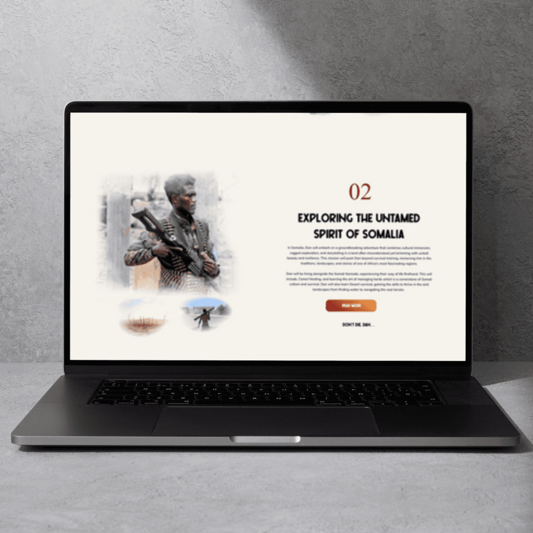
Cinematic Homepage with dramatic visuals, animated mission entries, and real expedition goals.
Mission Section showcasing each adventure with visuals and a call to “Buy Now to Join the Journey”.
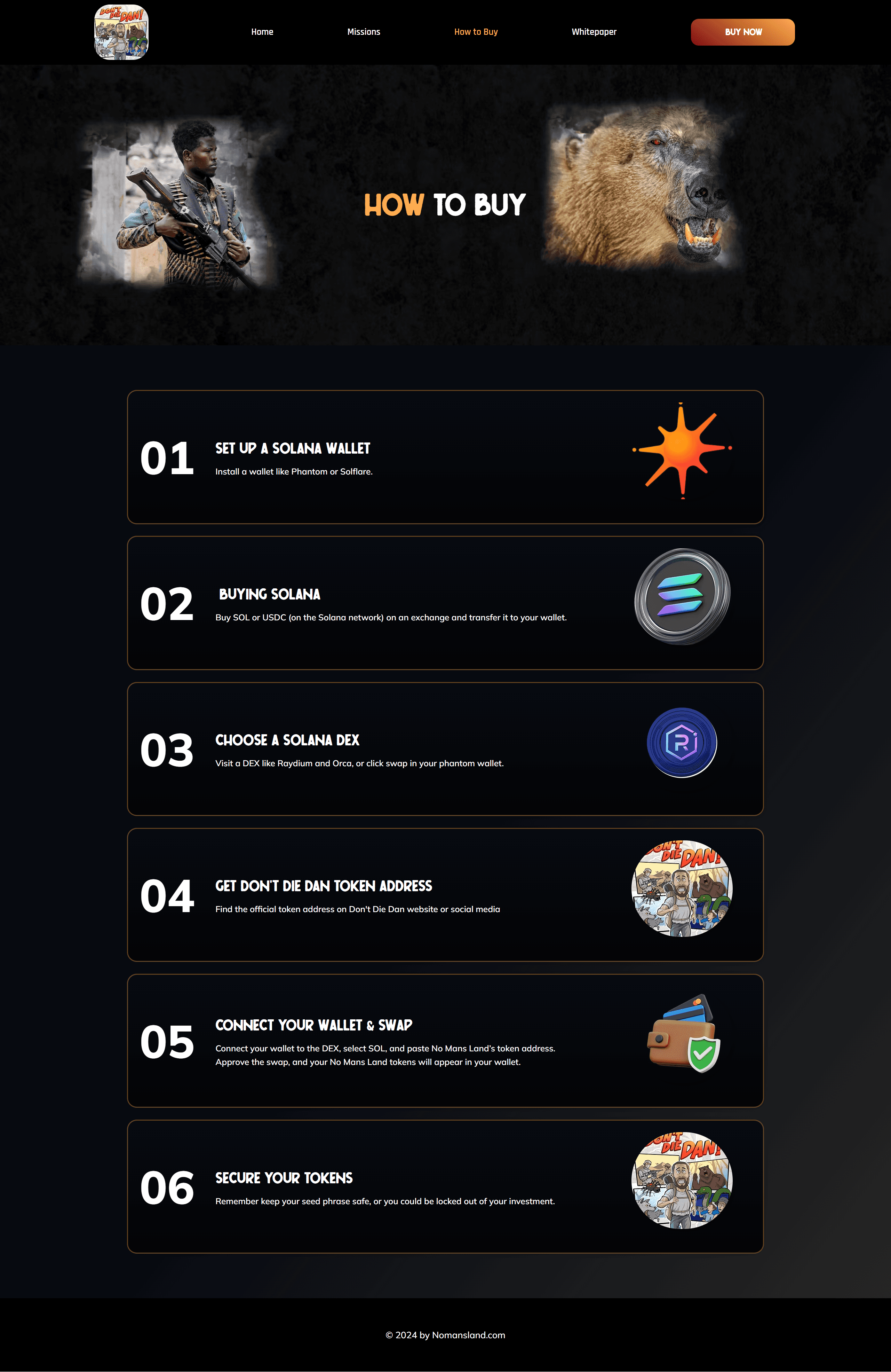
How to Buy Guide with 6-step visual breakdown for crypto beginners.
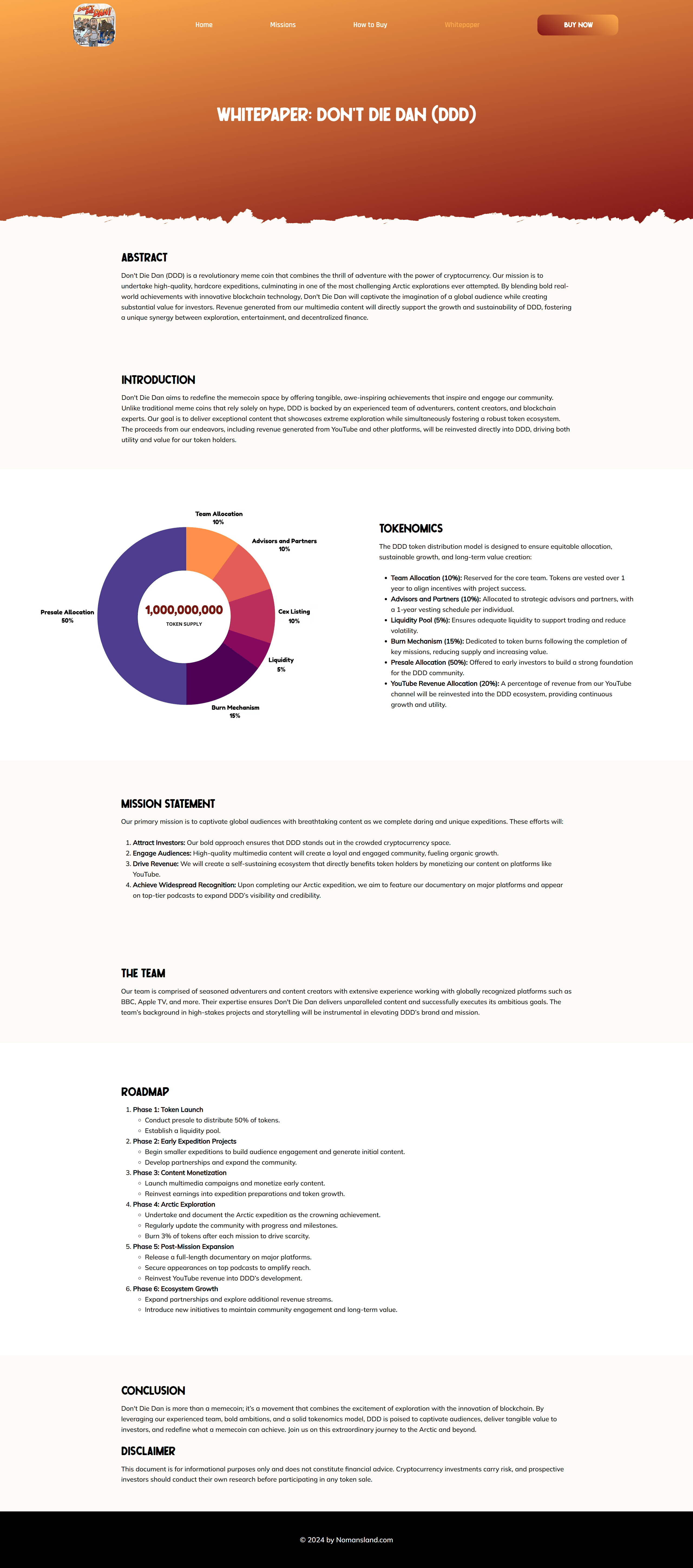
Whitepaper Page structured with bold sectioning, infographics, and simplified token language.
Tokenomics visualized with a donut chart showing breakdowns: team, advisors, presale, burn, liquidity, and YouTube reinvestment.
Fully responsive across all screen sizes and fast-loading assets despite heavy visuals.
💬 Personal Reflection
This project pushed the creative boundary between UI design and immersive storytelling.
Designing for both crypto utility and cinematic adventure required balancing form and function in every section.
If revisiting the project, I’d explore integrating interactive map navigation to let users visually track mission progress in real time.